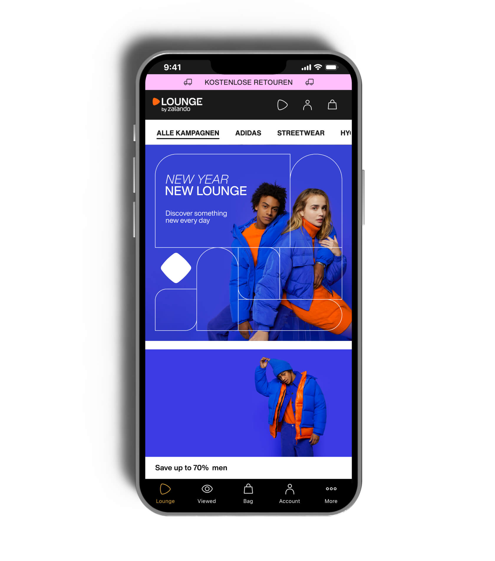
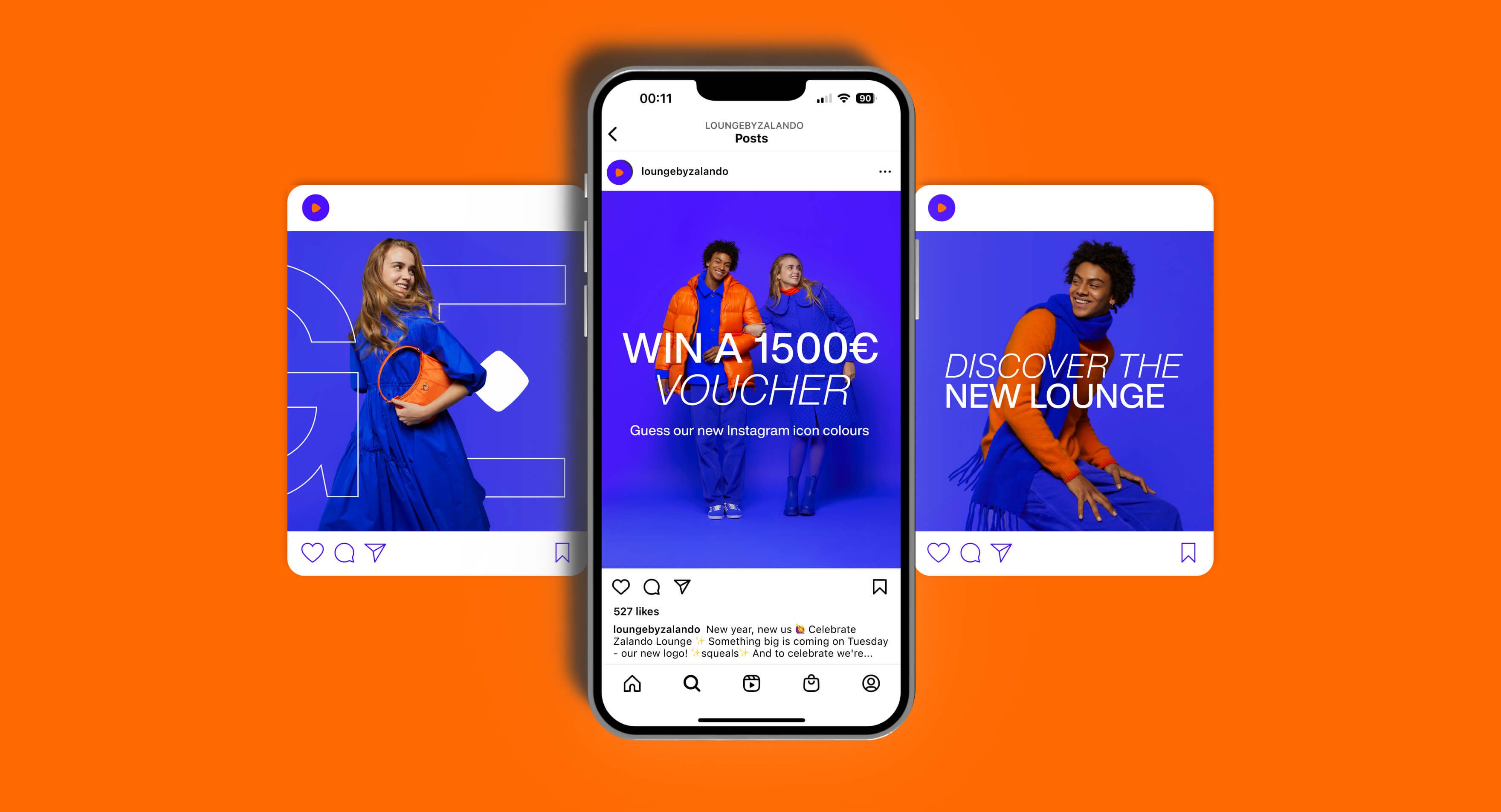
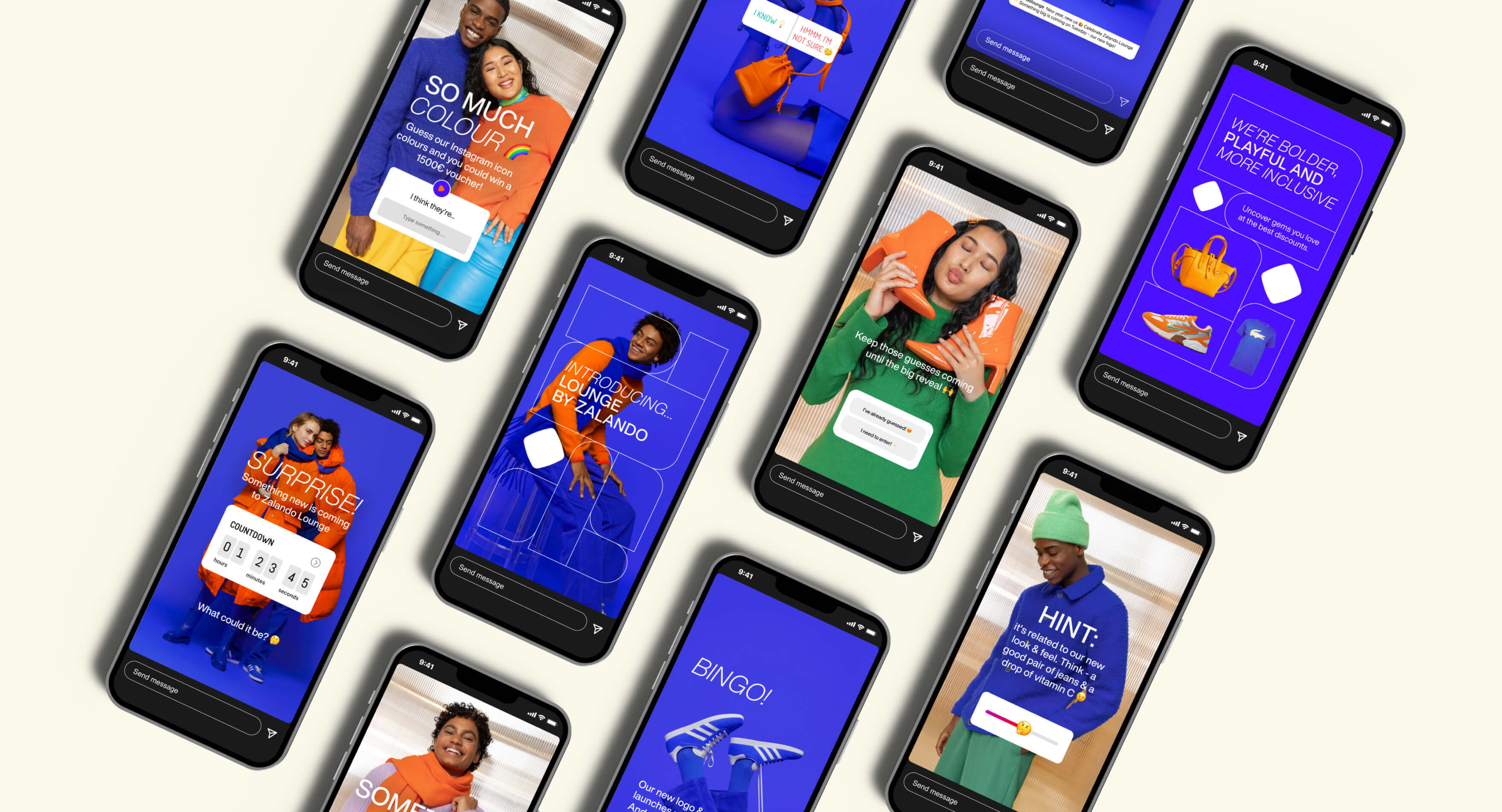
Lounge’s brand identity brings the ‘joyful treasure hunt’ to life. Lounge is the place to discover something new every day. Where there’s always more than what you came for - from big name brands at affordable prices to hot drops with amazing discounts, there's something for everyone.
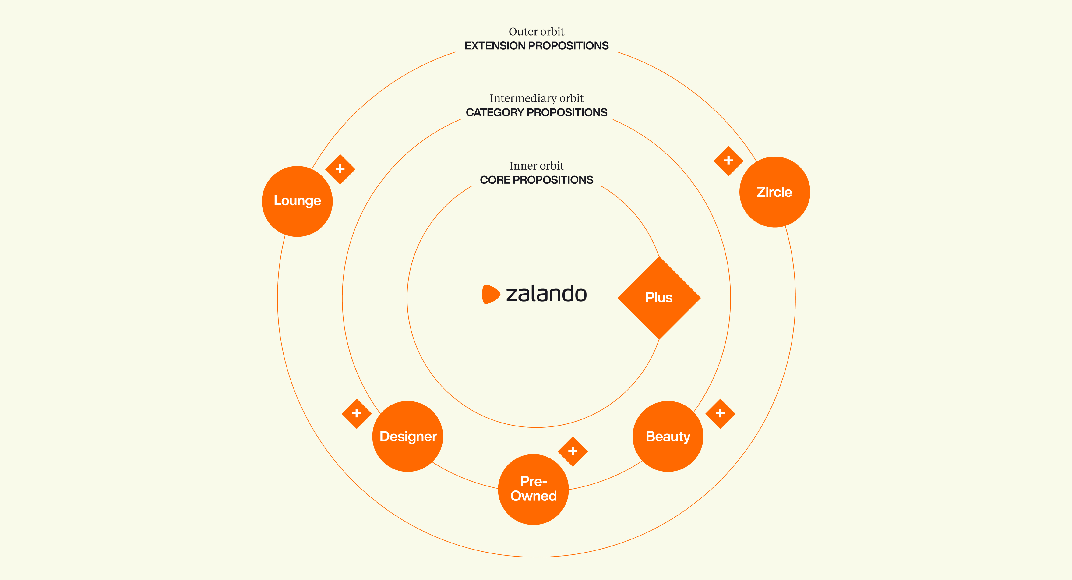
Zalando's solar system takes a holistic approach to the architecture of the brand, it defines the relationship between the propositions and categories with the core brand and also provides a future-proof framework. If Zalando is our sun, Lounge lies furthest away within its outer orbit. It sits as part of the Zalando experience but has its own clear character. Lounge has built on the brand equity of Zalando but has its own unique offering.
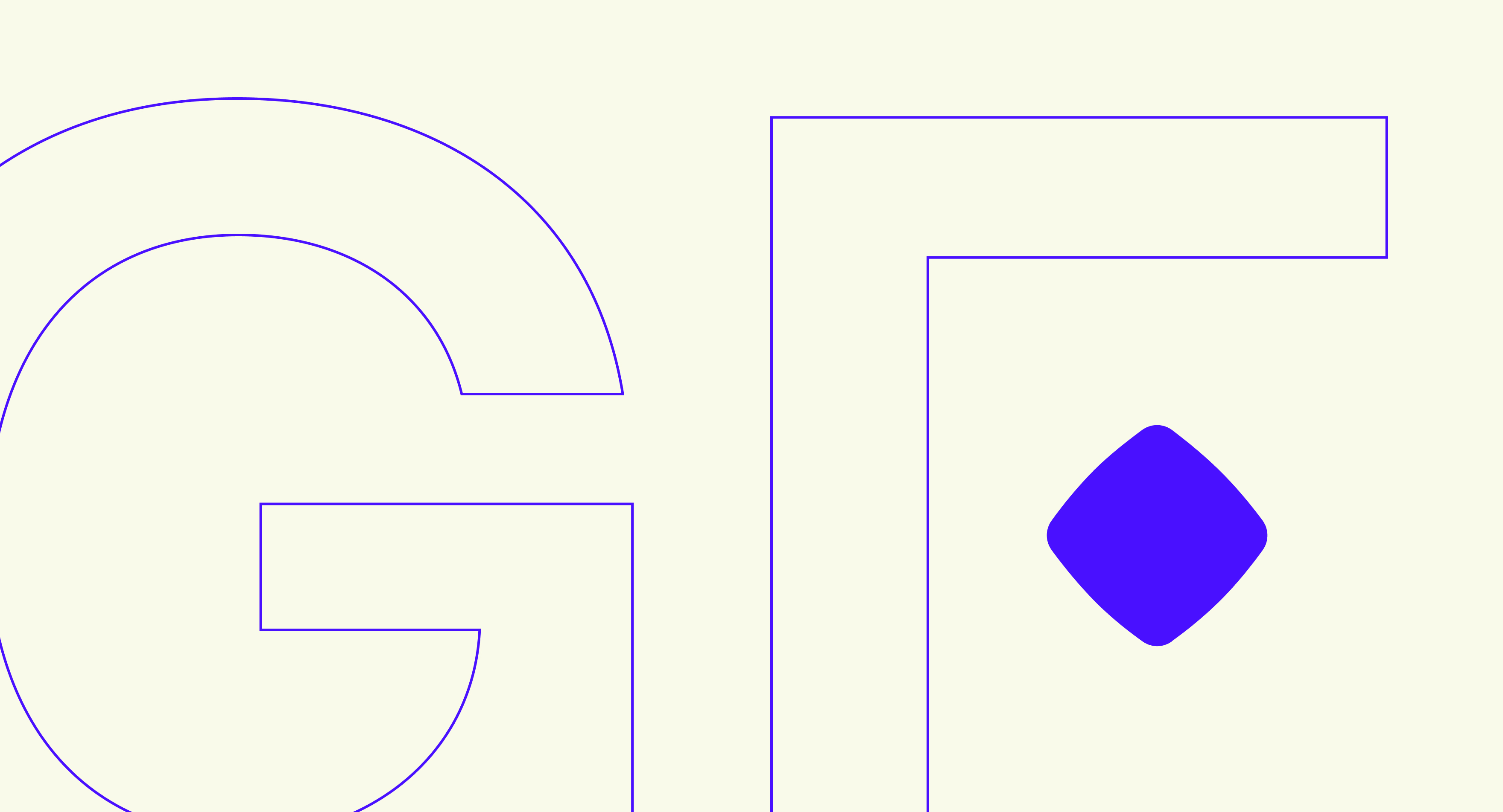
Born out of our strategic platform of ‘Joyful Treasure Hunt’, we bring discovery, wonder and delight by incorporating a gem into our wordmark – “Who knows what you might find...”
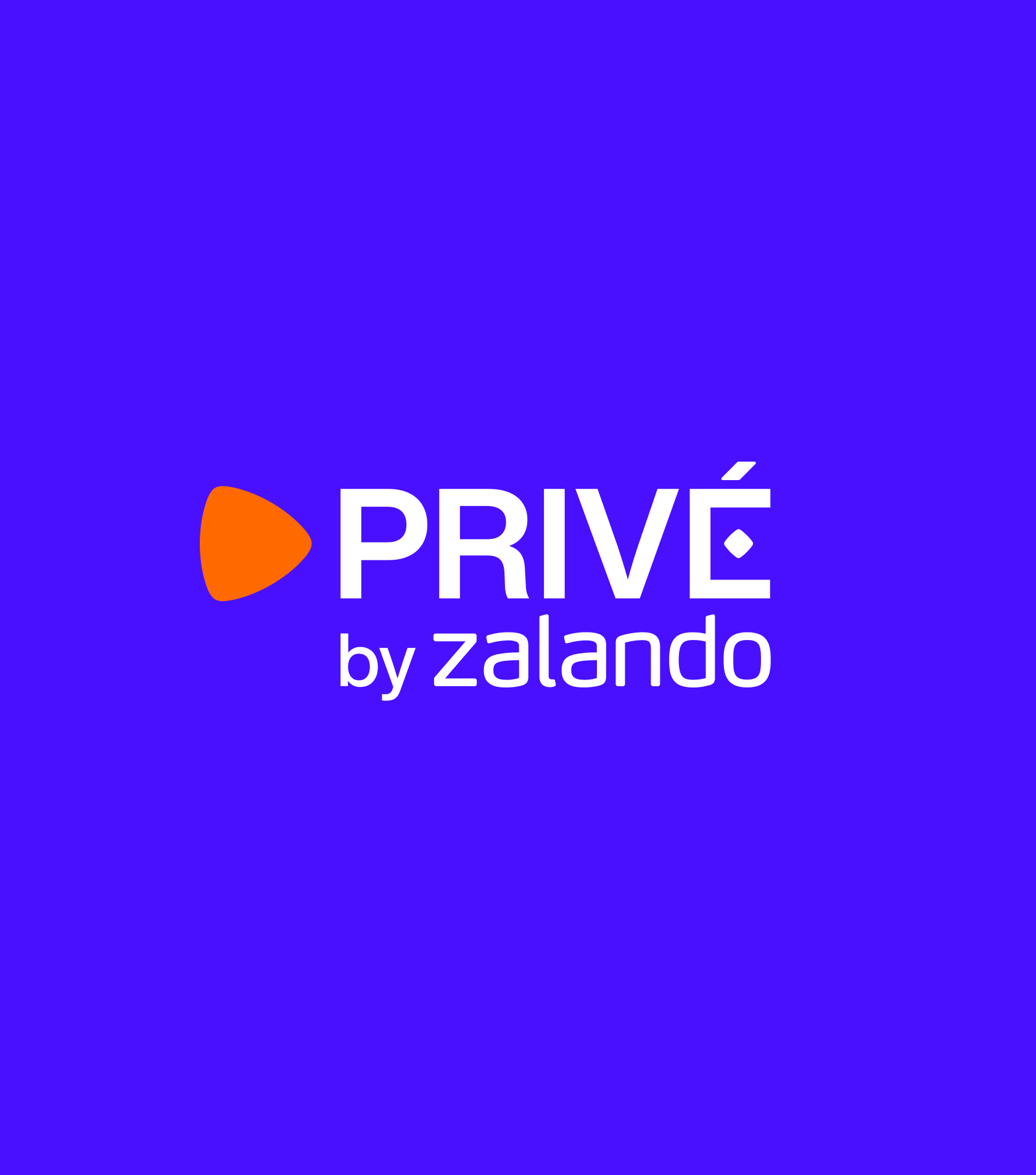
Our primary logo is in black and white to ensure visibility across different formats and contexts. We lock it up with the Zalando logo, putting the relationship front and centre of the brand. Our primary logo also has a French language variation ‘Privé’ to only be used in appropriate markets.
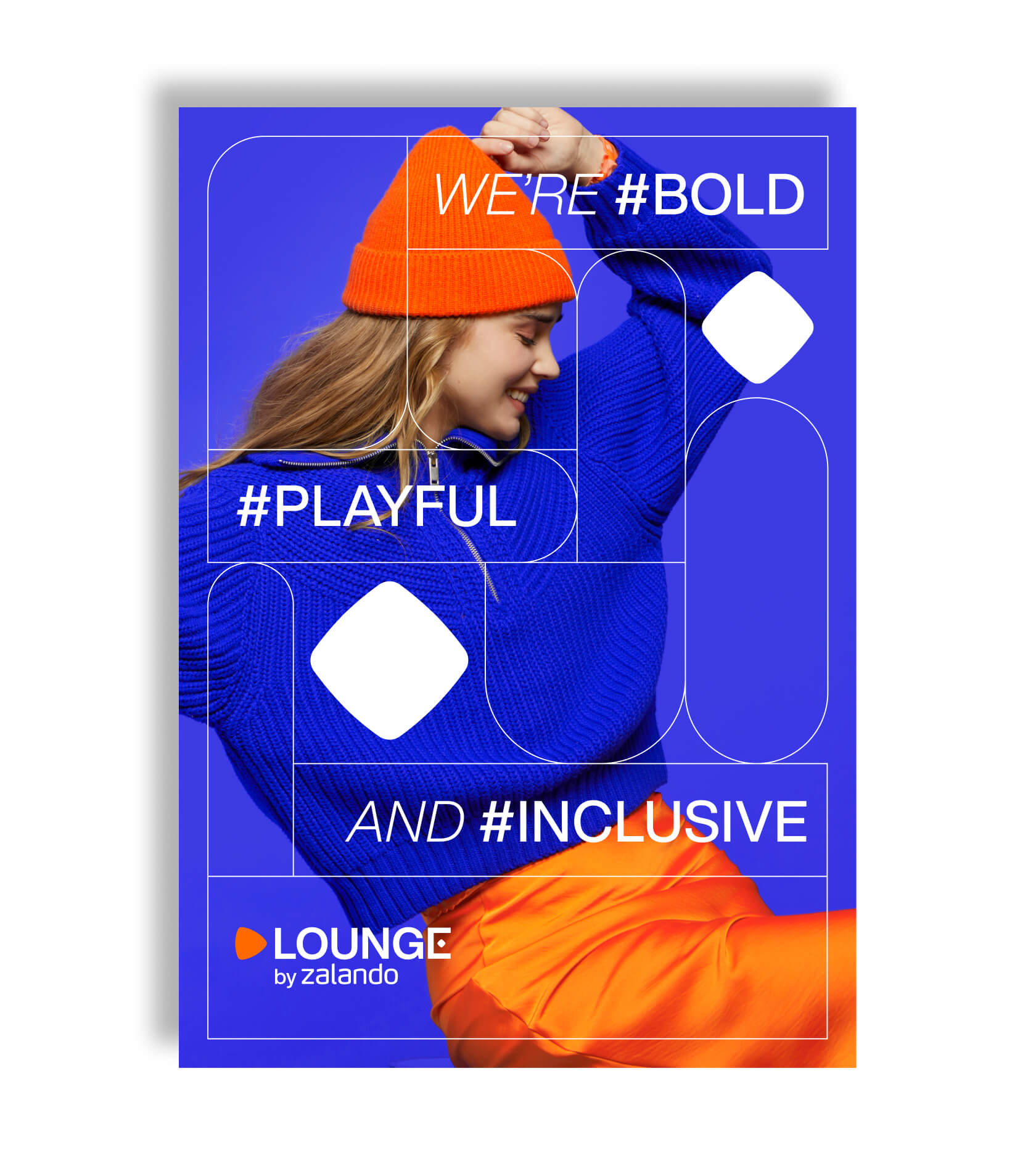
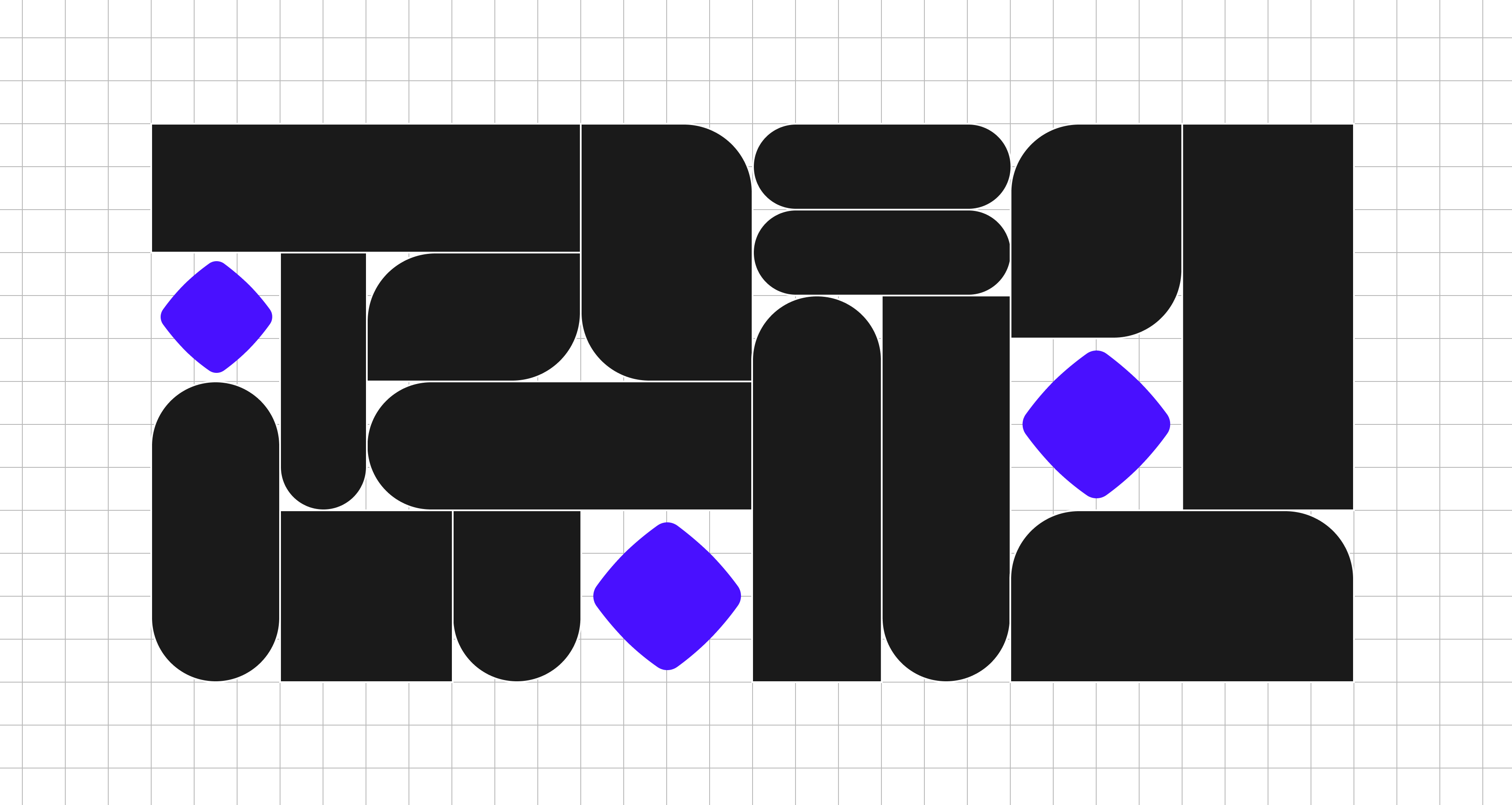
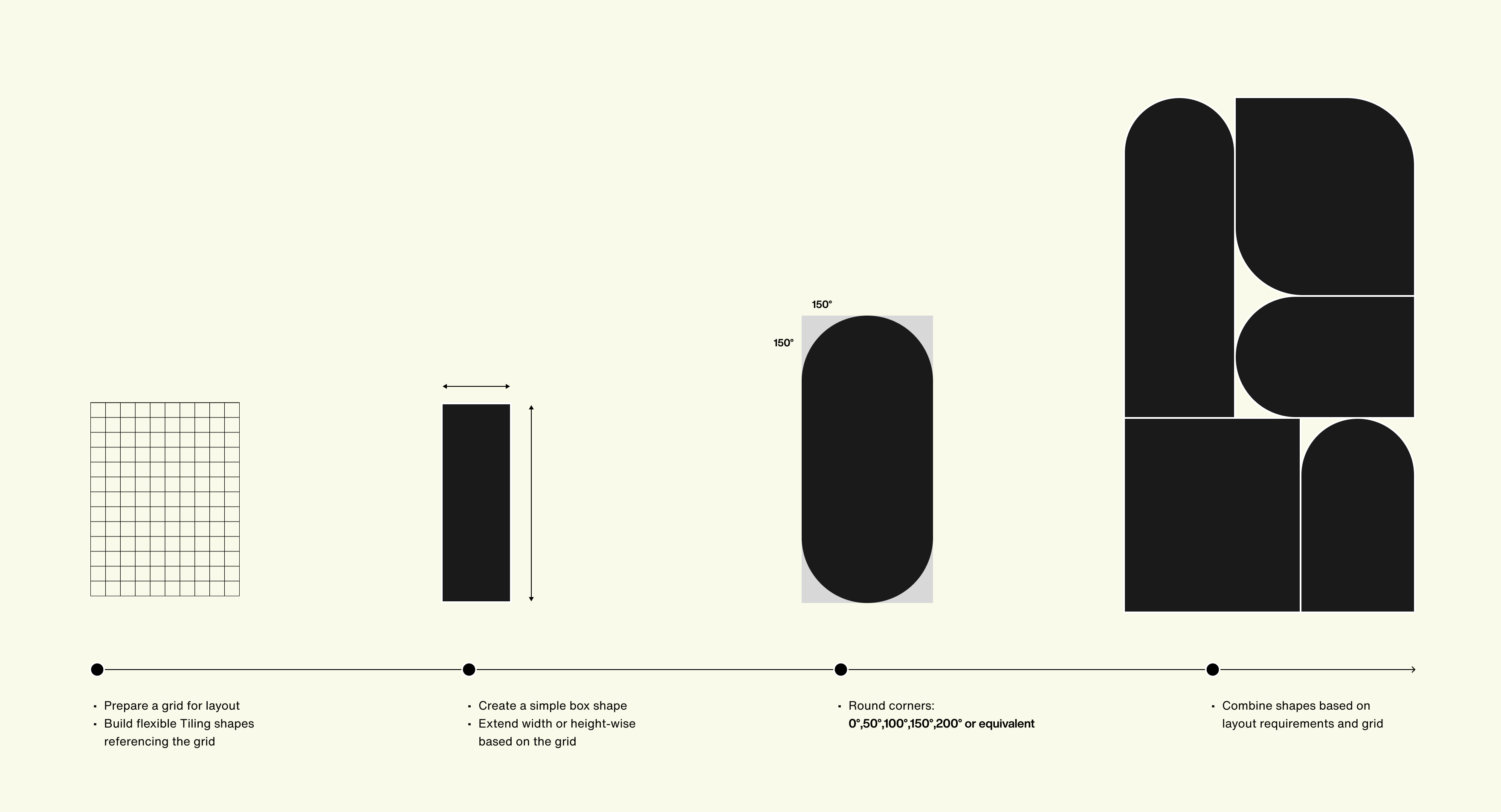
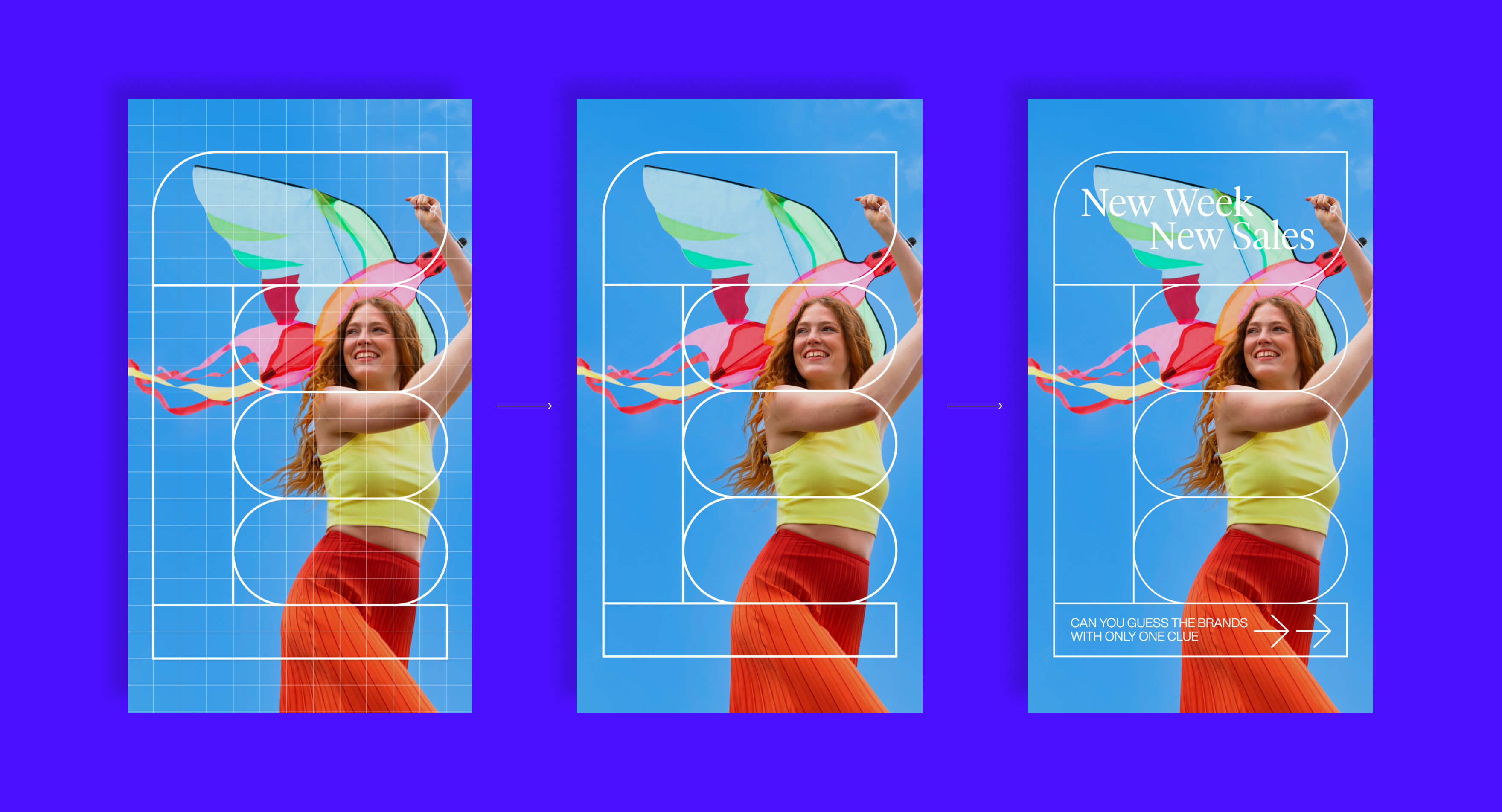
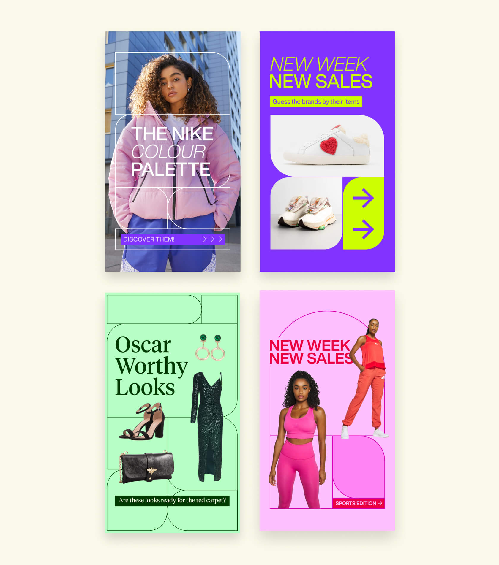
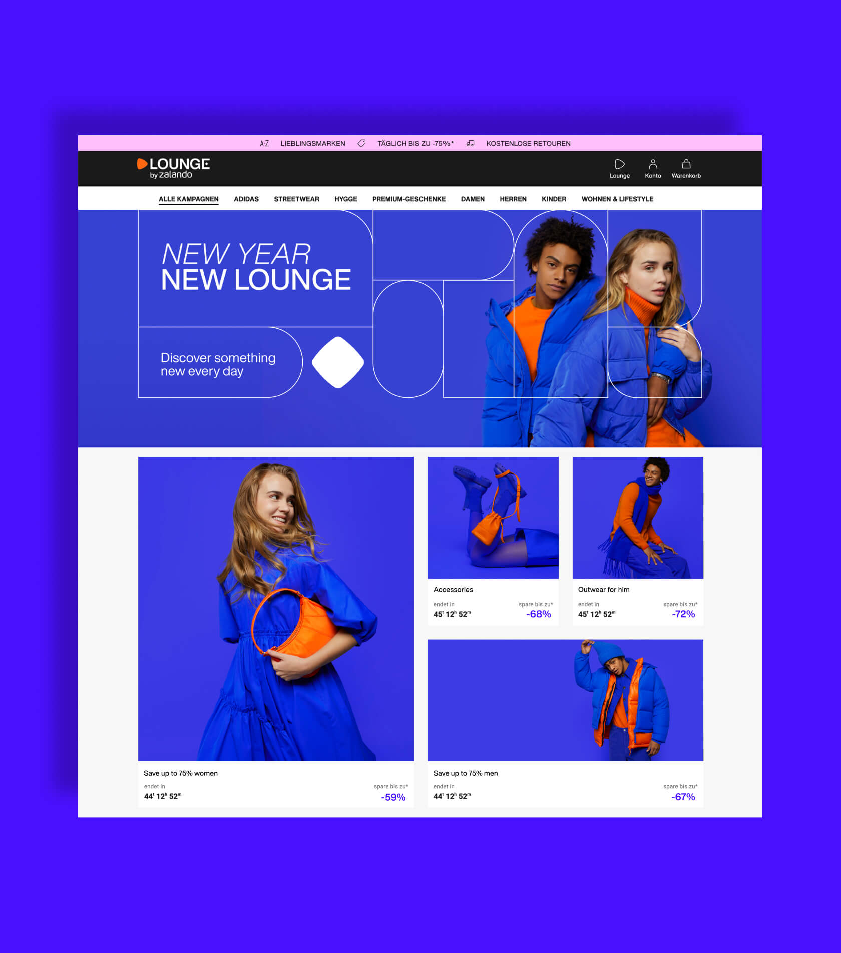
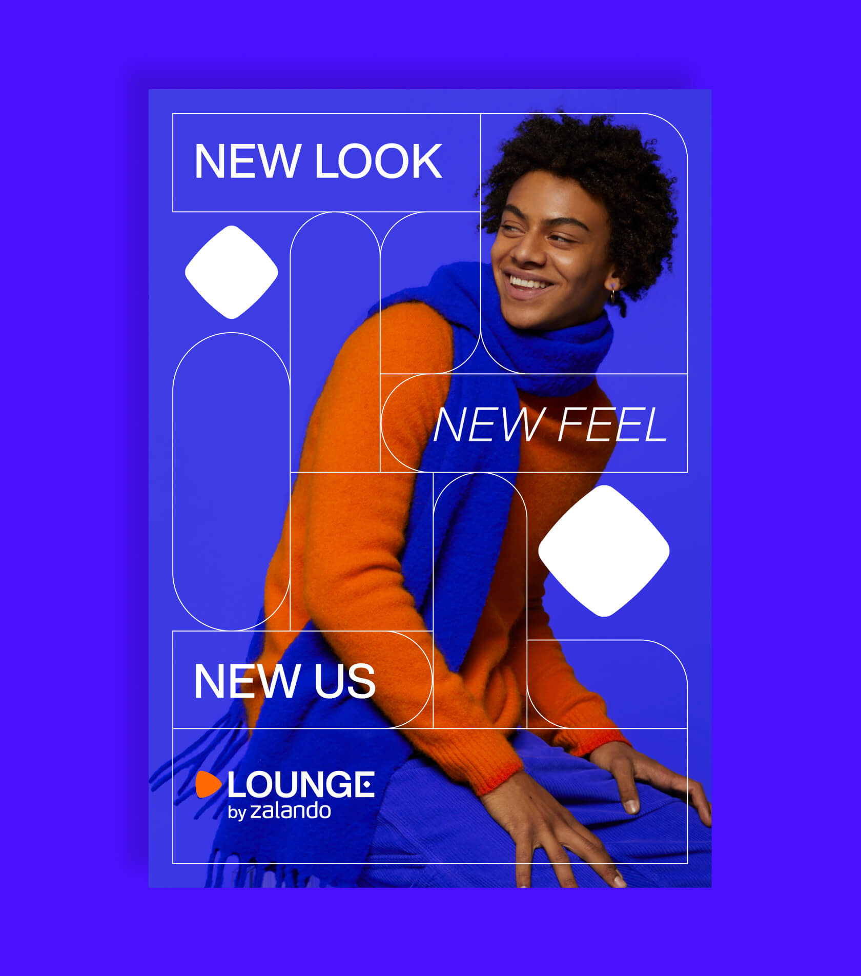
The Tiling System is a versatile graphic design system tailor-made for Lounge by Zalando, aimed at effectively communicating the brand's offerings across a variety of marketing channels. The design concept is inspired by the idea of building a personalized Lounge closet with the gems and daily deals that Lounge by Zalando offers daily. With its flexible shapes and grid-based structure, the Tiling System allows for easy customization of information hierarchy and image material requirements, providing a seamless and visually appealing experience for the customers. When navigating the brand's space you can also find the hidden gem in the tiles of some communications pieces, creating a stronger connection to the overarching brand concept.
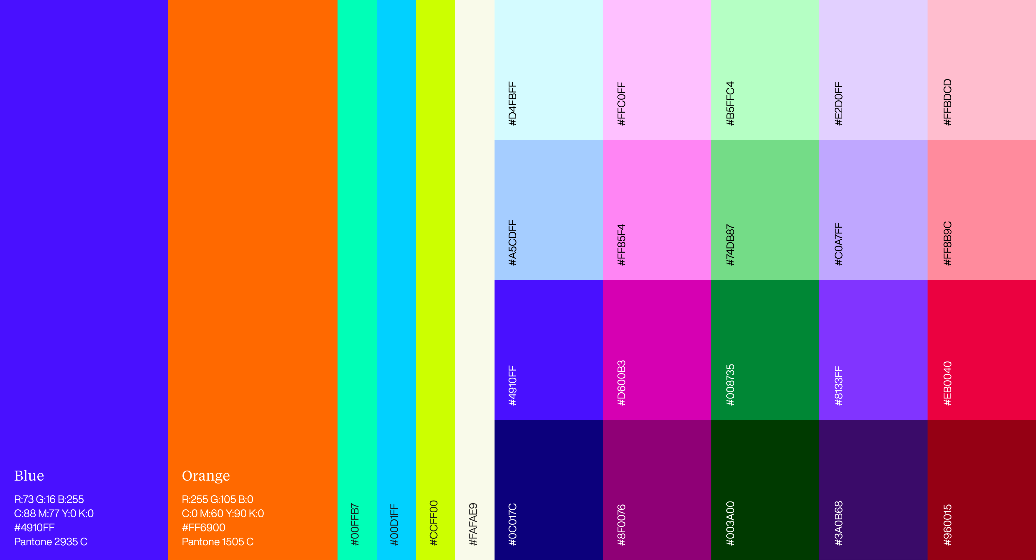
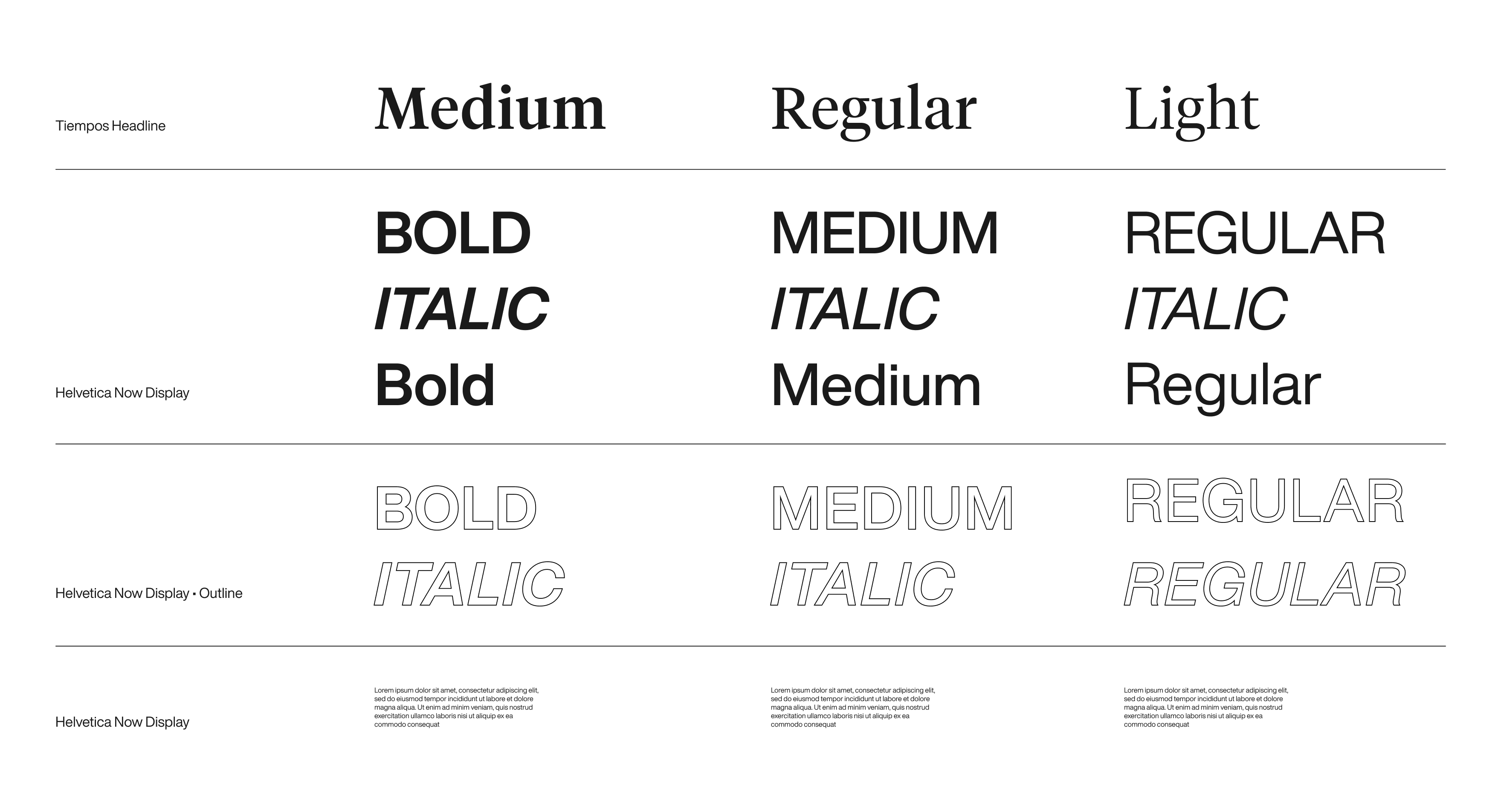
Our core color palette comprises Vibrant Blue and Zalando Orange, establishing a clear connection to the Zalando brand. The Orange color is exclusively reserved for the Zalando brandmark. As our brand becomes more established in the user experience, we will incorporate our secondary palette, allowing us to be more versatile in different campaigns and offerings. We have also taken a unique approach to the typography of our brand, utilizing two distinct typefaces, namely, Helvetica Now Display and Tiempos Headline Display, to create a clear hierarchy of messaging.
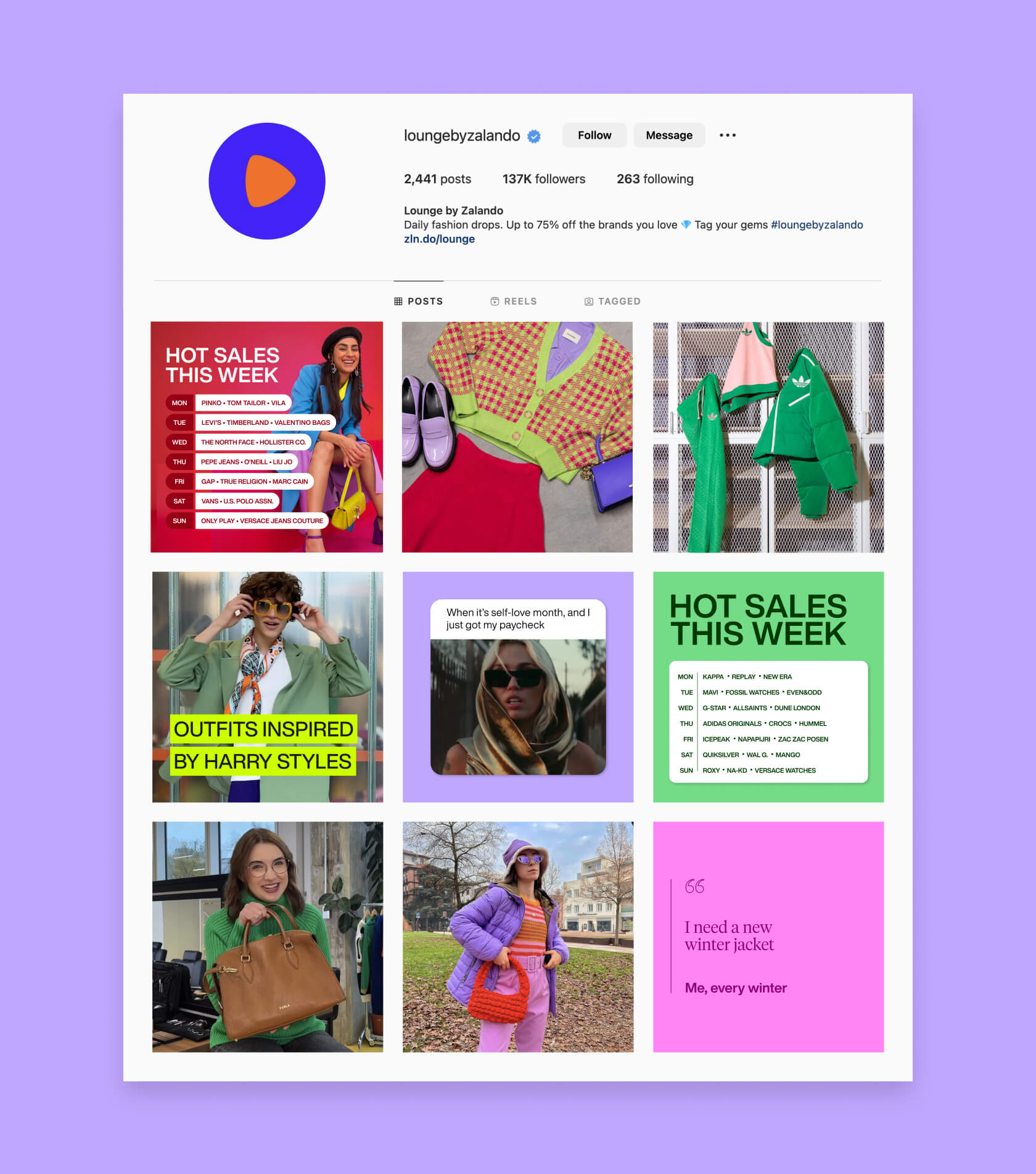
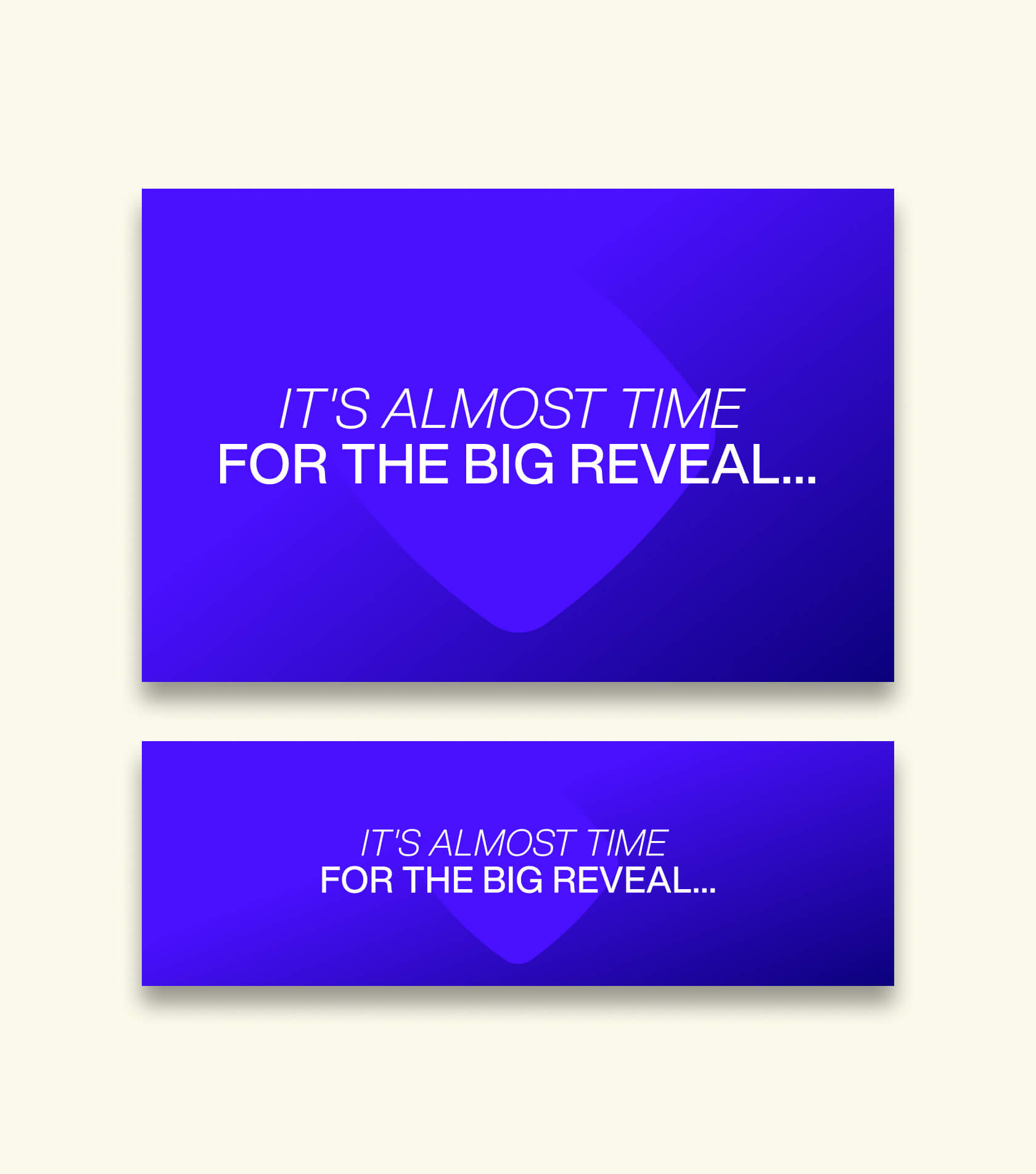
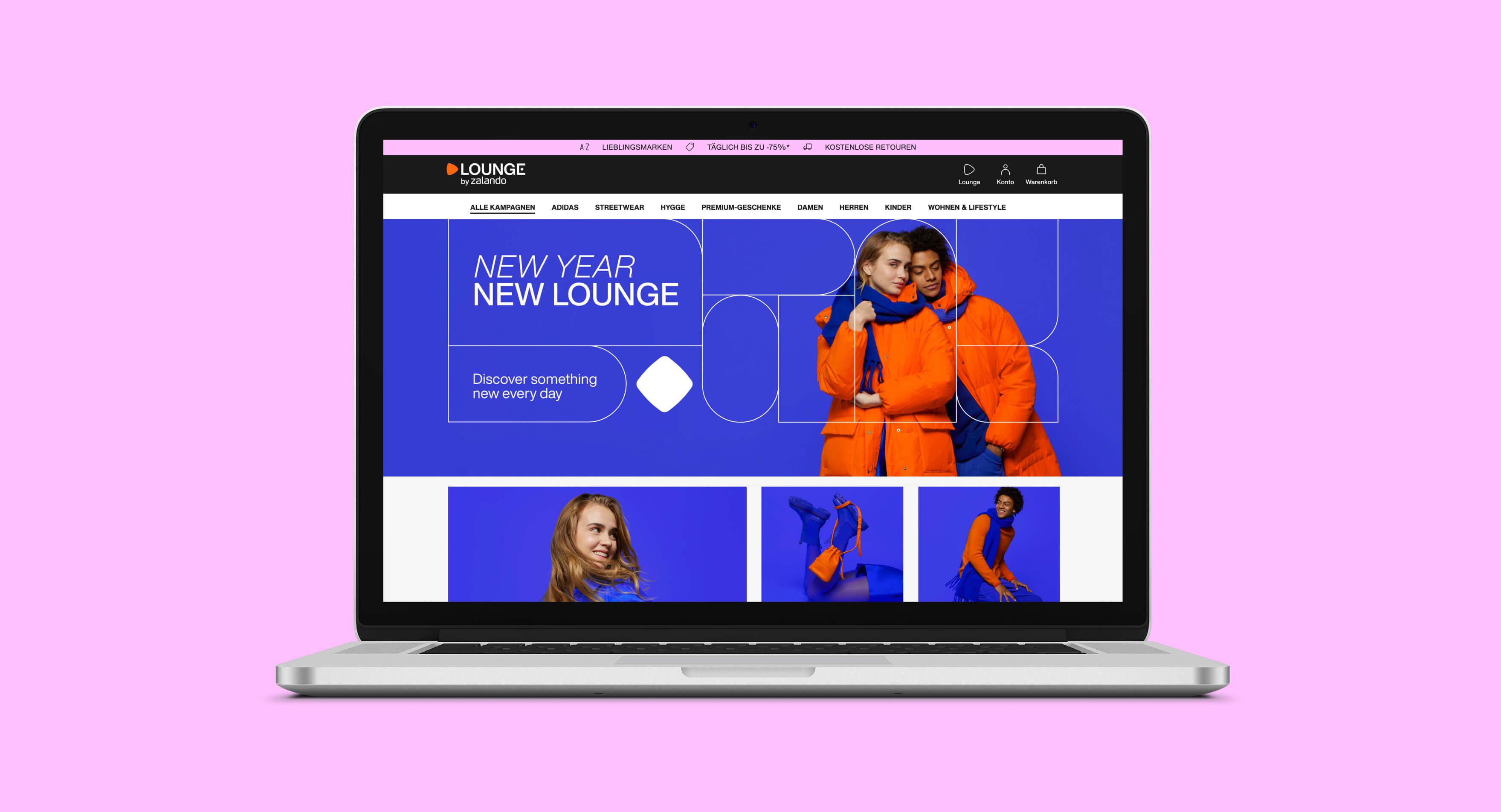
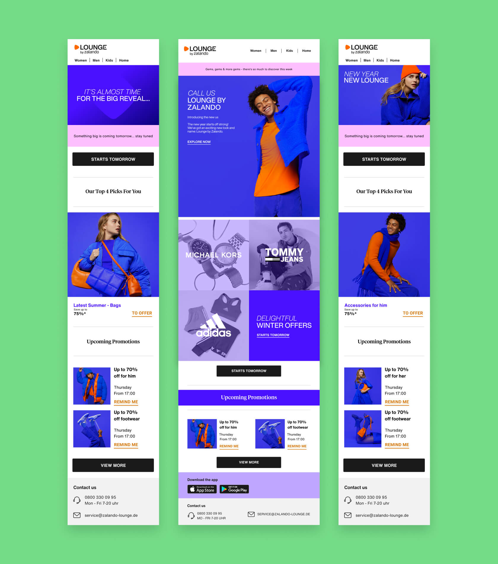
Our brand relaunch campaign for Lounge by Zalando consists of three stages: Awareness, Engagement, and Post-Purchase. During the first two stages, we introduce our brand to customers and help them discover our products. We use various touchpoints, including Social Media, CRM Newsletter, Home and Main Page, App Store, and a cross-platform journey with the main Zalando website.
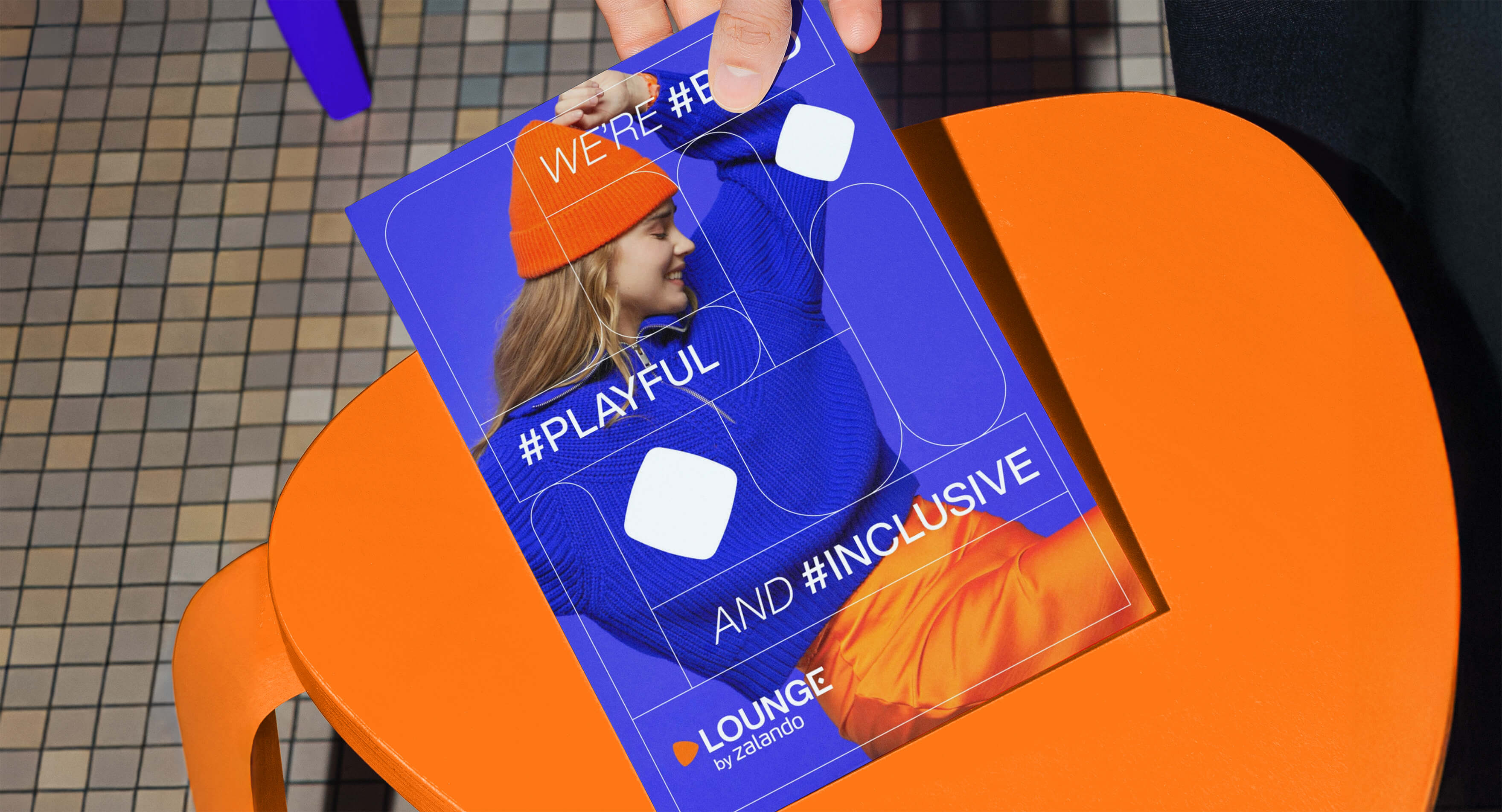
Our goal is to create a seamless and enjoyable experience for our customers while they explore the Lounge collection. We've also displayed in-house posters within Zalando campuses to celebrate the relaunch among our employees. Overall, our campaign is designed to create a positive and engaging experience for our customers at every step of their journey to reintroduce Lounge by Zalando to them.
